White space, the space around things is a powerful tool for a designer. But white space is not about space, it’s about the relationships between things and how that empty space affects those relationships. If there are two things and they have little or no space between them then they most likely have a relationship. This might be a title and image for a blog post. When the space between them gets larger, the relationship gets looser until they seem completely unrelated.
The lack of white space, things touching or overlaying each other, should also be considered when thinking about relationships. 62 models plays with the white space between the category title and the category image. They move the title closer, and even overlay it, as you hover over the image. Not only are they using white space to convey relationships, they are also using motion.

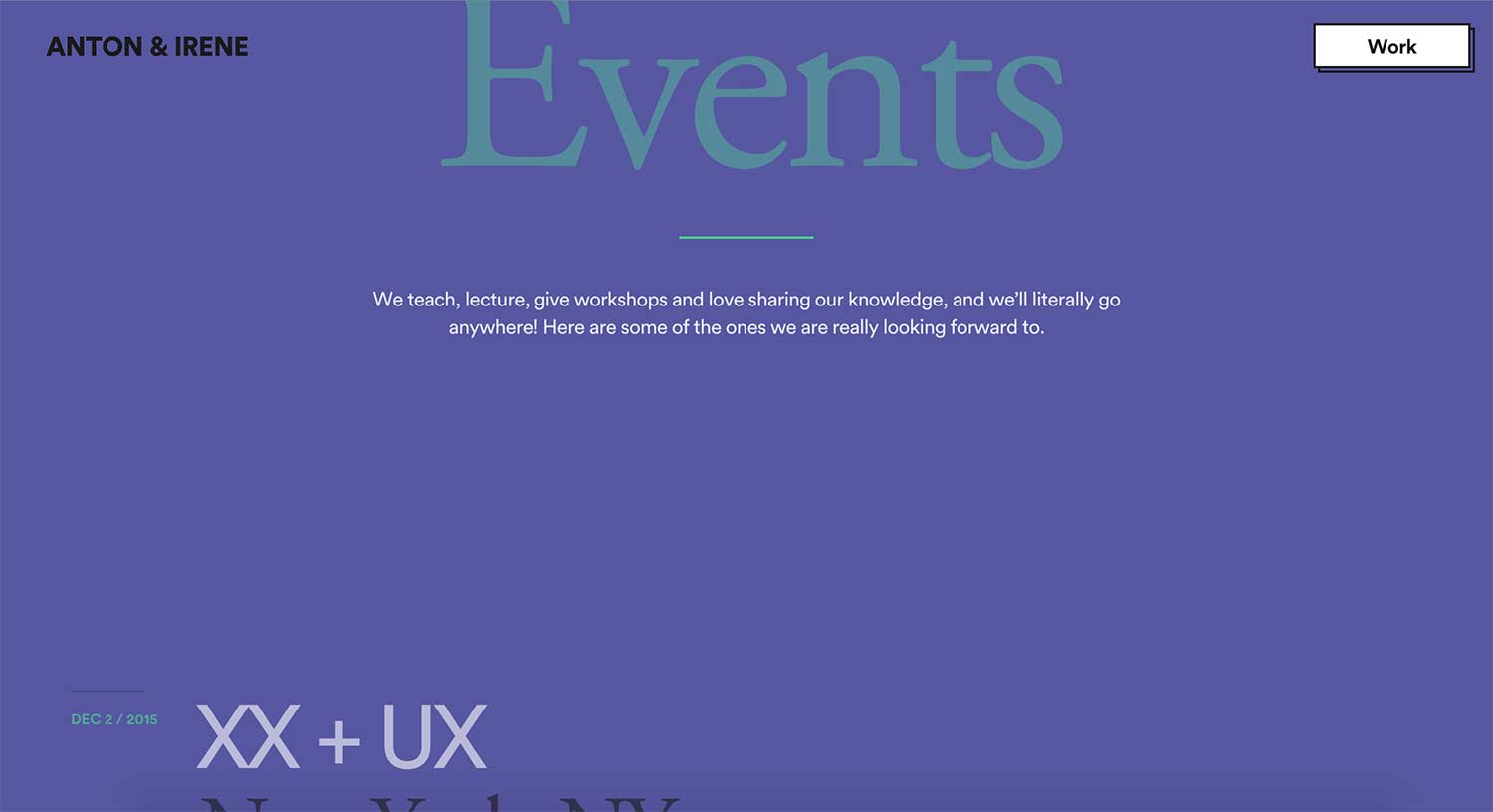
As we see with the previous example white space does not live in a vacuum. Designers can use more than space to convey relationships while allowing users to make connections between elements. And it can be done while achieving a look or style. Anton & Irene use a lot of space between the introduction of a section and the content of that section. In another design, this heavy amount of white space would have created too much separation between those two elements. They use colour to bring everything together and create relationships. They also transition between colours when entering a new section. This gives the user a clear understanding that there is a relationship between the intro and content.
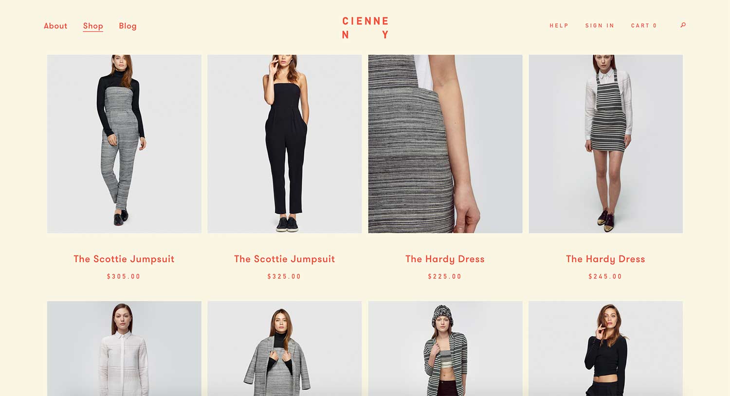
White space can also cause issues when left unchecked. For example, how easy a page is to scan drops when white space and things like proximity are mismanaged. On Cienne NY’s listing page, it’s unclear at a glance which title and price go with which photo. Because of the even spacing the relationship is unclear. This can lead to mental fatigue for users. Users now need to parse the title and match it to an image before allocating a price to that product.
With responsive design, this issue is multiplied. Relationships and white space now need to be assessed at a variety of breakpoints (and everywhere in-between). What looks like some good spacing on a tablet, might end up being too much on a phone. If you’re using relative units like percentages than what might look good on a desktop ends up too tight on a smaller device.
For some more examples and inspiration check out:
www.webdesignledger.com/21-inspiring-examples-of-white-space-in-web-design
www.designyourway.net/blog/inspiration/the-importance-of-white-space-in-web-design-with-examples/