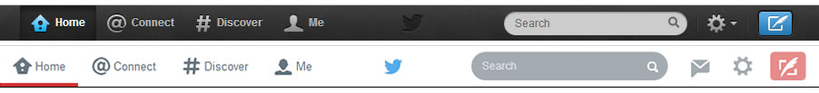
Twitter recently launched a redesign of twitter.com. They’ve flattened out the last few bevels, shadows, and gradients they had left, and we are now left with a 2 dimensional version of what twitter once was. There are some UX updates, like adding your cover photo to the corner profile on the home screen, and adding a dedicated nav button for direct messages. All in all this update seems a little forced, and really doesn’t improve the users experience.
It’s hard to say how many people actually use the .com interface, with the official app, plus many others, getting most of the attention of tweeters it’s potentially a low number. This redesign is definitely not as important as an iOS app redesign. Some are already saying this is where flat design has jumped the shark. With huge digital companies succumbing to the trend, and in some cases doing it quite poorly, this could spark young agile designers and agencies to move away from flat design.
Whether you like the new look or not, you have to give Twitter credit for at least trying new things and trying to keep their design game relevent.
Update: Twitter has just recently launched a new, more extensive, redesign. It borrows a little from Facebook and is definately trying to accomplish … something. What that something is I can’t say. With most Twitter traffic coming through mobile apps, the question of whether redesigning the .com interface so heavily will have much impact on Twitter’s overall goals still remains.