We’ve heard all about the notch. It’s not great. But one thing I found interesting about the iPhone X launch was the website redesign that came alongside.
The Good
Apple has had beautiful web experiences for the past while, but they have never been completely innovative as far as web & UI design. Apple tends to stay right on the curve though, doing things other companies their size would never do on their .com’s but never as daring as small, or experimental sites. This is understandable, of course.
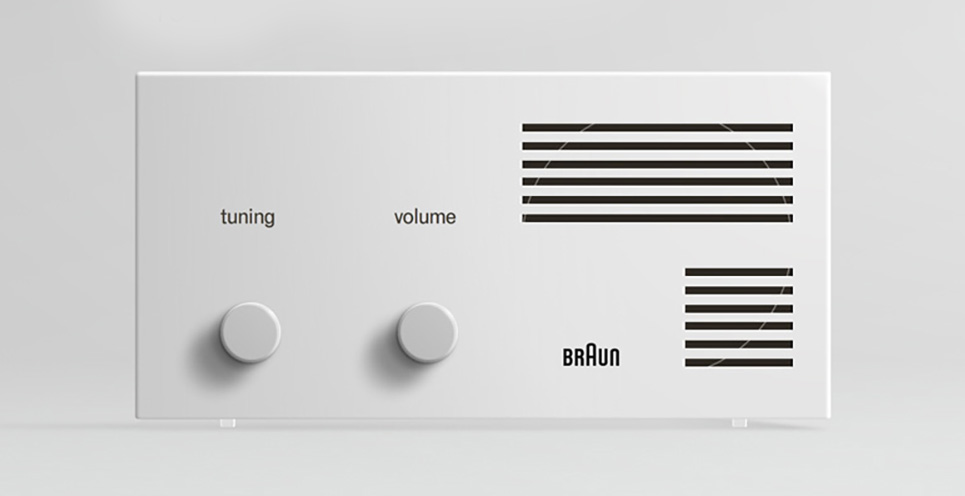
But this new refresh, while not revolutionary, is interesting. It immediately reminded me of classic Braun/Dieter Rams design, a style that heavily influenced Apple’s chief designer, Jonny Ive.
They also use hints of motion design, enough to give the page life but not gaudy or distracting. It’s easy to get carried away with things like that.
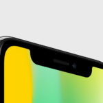
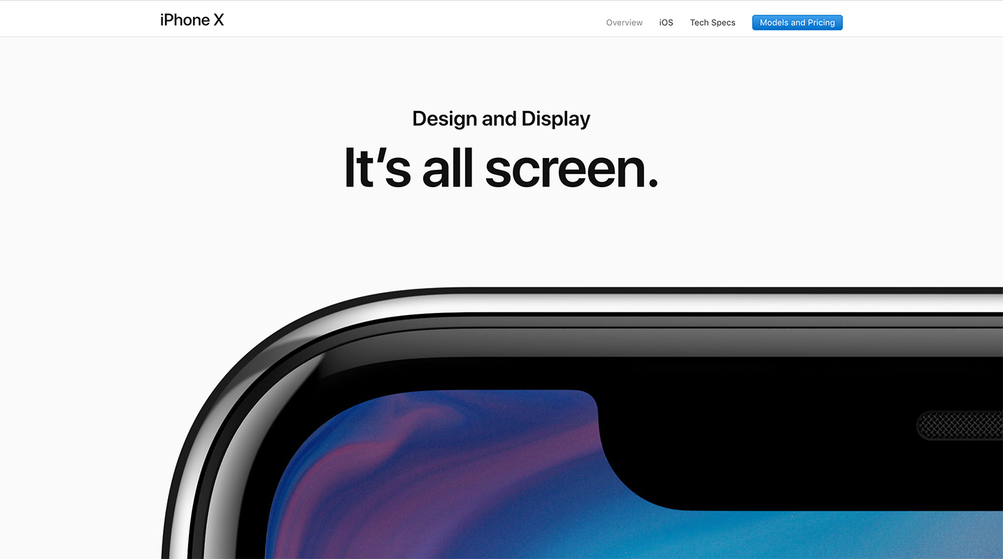
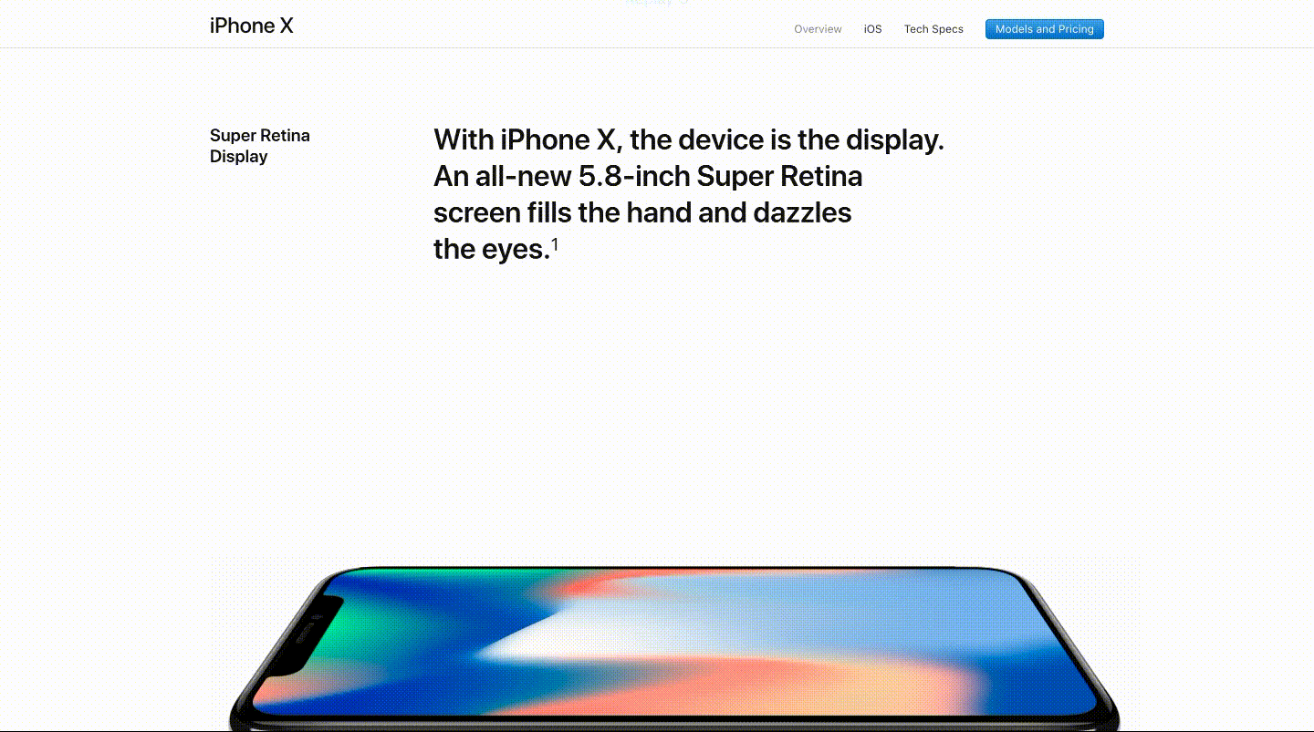
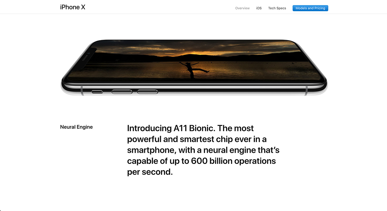
It’s stark, bold and unapologetic. The UI is functional rather than cute or playful. It’s such a counter to the marketing of the phone itself, which uses liquid paint motifs and bright colours to highlight its main feature, the edge to edge display (minus the notch).
It’s such a counter, in fact, that at first I was shocked by the choices, but as I look through it I can see why the choices were made. The site is bold but lets the product shine in its own way.
The Bad
The copy, however, leaves a little to be desired. It’s a little more subdued and placid than in past websites. A little boring and maybe too technical at times. They use copy like “The four efficiency cores in the all‑new CPU are up to 70 percent faster than A10 Fusion. And the two performance cores are up to 25 percent faster” instead of graphics or icons.
The pages are long, too. They seem to go on forever with no clear waypoints. I am all for long pages, whatever the content needs to breathe and be impactful. But, at some point, without a way to easily move around your page is just too long and out of control. Because of the length of the page, the sections, that at first were harmonious and in-sync, become repetitive and blur together.
Conclusion
All in all, I like the direction they are going but there’s still work to be done to make it an A+ experience.