
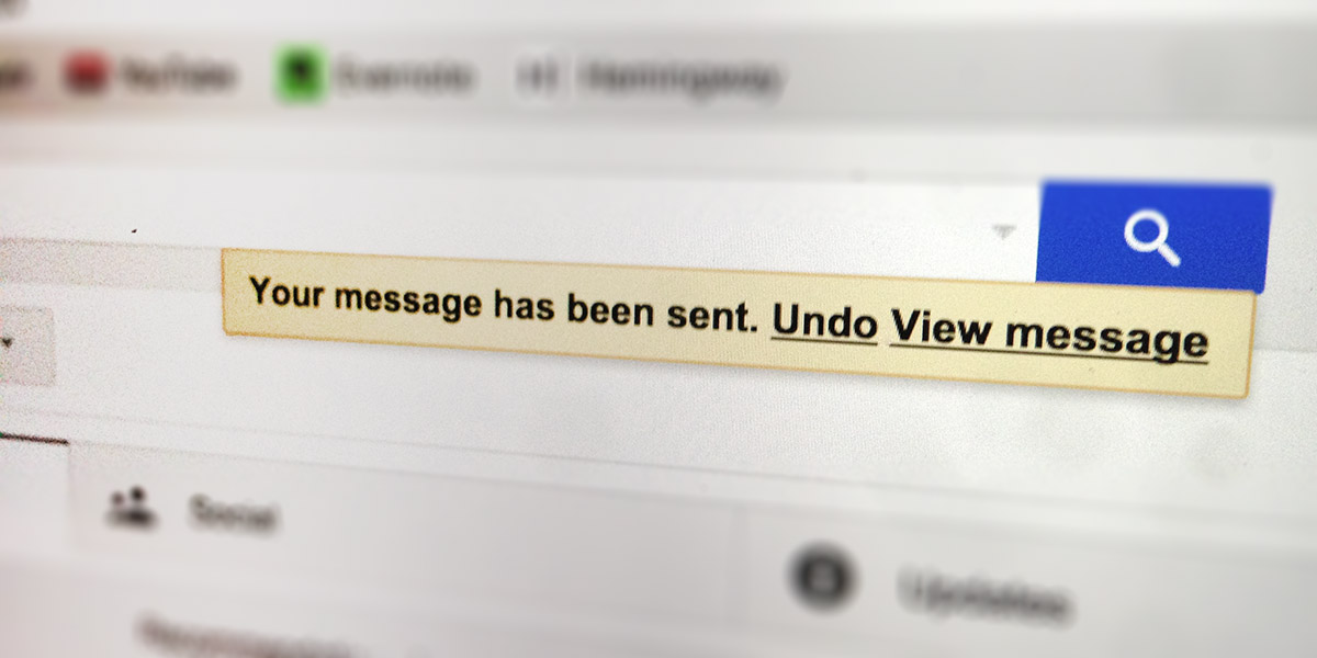
When you send an email with Google’s gmail web app a little message pops up. The message says “Your message has been sent” along with 2 actions: “Undo” and “View message”. This little message replaces a much more prevalent convention, the confirmation. If google used a confirmation you would likely see something more like “Are you sure you want to send this message?” with the actions: “Yes” and “Cancel” (or “No”). Only when a user clicked “Yes” would the message be sent.
This type of confirmation is widely used on the web. But why does Google take a more passive approach? It’s just a better experience:
- It respects the users initial intent – In most cases the action the user took (sending an email for example) was completely intended and asking the user if they were sure disregards that intention.
- It removes an extra click – If you can save your users a click everytime they complete an important action, that’s probably a good thing.
- It’s less obtrusive – The undo action is passive and does not need to be in the user’s face. (ex. Gmail has a small yellow bar near the top of the page to undo).
This UX convention is not limited to sending email, there are many variations of the confirmation that can be converted to an undo. If the user most likely intended the action, so we must ask ourselves why should we add that extra click?
Really good UX design is the combination of many small, but thoughtful, ideas that are not only obvious to the user but delight them as well.