
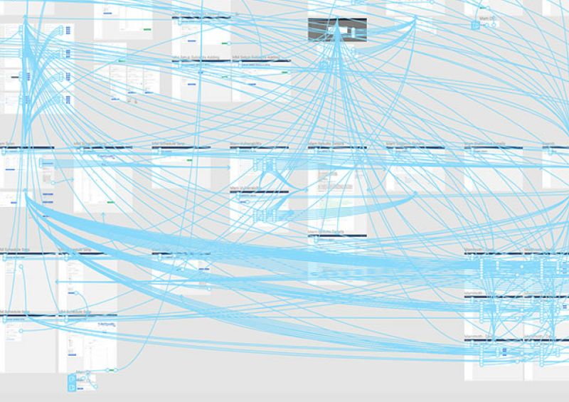
When you open Photoshop or Illustrator it presents you with a canvas. You decide exactly how big that canvas should be. It has edges that, when crossed, ignore anything you put outside its bounds. The web has a viewport, but don’t mistake the viewport for a canvas. The canvas of the web is infinite, and the only finite thing is our window into it. When we realize this we can reflect on how we design for the web. We have tricked ourselves into this physical world of folds and constraints. There is no fold because there is nothing there to be folded.
Scrolling
At some point in the webs history scrolling vertically to see information outside of the viewport became the standard, further compounded by the mouse and its vertical scroll wheel. Yet, many things in our lives pass us by from side to side, a more natural motion, which is not reflected on the web often. Monitors have also changed (from square to widescreen), which compliments the way our eyes see. This gives us more horizontal space, but eats away at our vertical space. These points don’t mean scrolling vertically is wrong, rather we must think about the online experience we are creating, instead of following the status quo.

Adopting styles like the “content tube” wholesale (which go hand-in-hand with vertical scrolling) also makes it easy for our designs to suffer from leftover space. When designing responsively we consider things like line-lengths, keeping them at reasonable numbers, but with widescreen monitors we are sometimes creating leftover space. Unlike white space, leftover space is not useful it’s just … left over.
Responsive Design
The thing I love most about responsive design is that it encourages the use of the whole screen. If you work mobile first you soon realize every square millimetre of space is valuable on those small screens. As you work your way up to laptops and desktops you develop an understanding of the entire viewport and how important every square millimetre still is.

This is not to say that something can’t be simple. Or that it can’t even be nothing. Sometimes, the best thing to fill up the viewport is empty space. Empty space that has a purpose is always better than leftover space. Some studies show that strategically placed whitespace will increase a users comprehension of the page. Leftover space is useless and leaves us with the feeling that something is not what it could be, that there is something left to be desired.

I was watching a documentary about a child art prodigy, and one of the experts pointed out the difference between a regular child’s art and that of an artist. The biggest difference is a child will draw disjointed items on a canvas (Think of a child drawing their family with mom, dad, themselves, the grass, the cloud, the sun are not touching). An artist will compose a complete image, he will use the entire canvas, and even if some of it is left blank it still serves a purpose. There is cohesion, there is completeness. The artist uses the whole canvas whether the paint touches it or not.
The web is amazing. It’s unlike anything, really. It’s always more fun to take full advantage of it’s uniqueness rather than force the qualities (and drawbacks) of other mediums onto it.