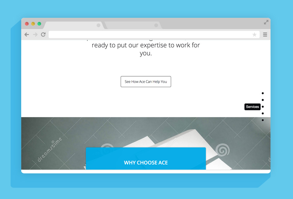
Thursday November 13 As the code is cleaned up, design elements are also tightened up. Spacing and typography are honed and tested accross multiple devices.
Monday November 10 Because we wireframe and mockup with real code we can produce production code much quicker. After back and forth with the client, we are now cleaning up the codebase to get rid of all that “let’s try this out” code. We are also trying to normalize the look accross multiple browsers and devices, which can sometimes prove most difficult. We are still iterating on details but the general look and direction of the site is decided and we can now build on that rather than build next to it.
Tuesday October 14 After some time away from the project we continue with HTML mockups and establishing some HTML and CSS patterns for production. It can be extremely illuminating to take some time away from the project and then look at it with fresh eyes. With that new perspective you can sometimes see new, and usually better, solutions to the design problems you are solving. As we finalize HTML and sketched wireframes/mockups we will transition into producing production code.
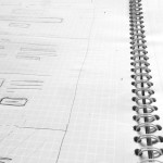
Tuesday September 23: Design work has begun in the form of wireframe sketches and crude HTML mockups. We get into HTML mockups very early becuase a lot of web design, for us, is about movement and interaction. We want to see how elements move and their different states as early as possible rather than spend time mocking up pixel perfect comps that will never be the final result in this responsive design world. We play with spacing and flow on a very high level. When we are happy with some overall design & structure we will go over sketches, ideas and the HTML mockups with the client before moving too far ahead. Some imagery to come soon.
Thursday September 18: Starting the initial design stages. We are gathering and auditing content and thinking about user flows, which are going to be fairly simple since it’s a one pager. We are also going over typography, colour and other broad stroked. Initial ideas propose open sans because of it’s small footprint (for performance reasons), it’s nice lines, it’s look on screen and it comes in multiple weights, which are all designed beautifully.
Sunday September 14: Below is the logo supplied by the client. Because the content is light, and to the point, we have decided to go with a single page website. A single page website is easier for the user to navigate without having to load pages, especially if there isn’t a heavy amount of content being presented.