Designing in the browser
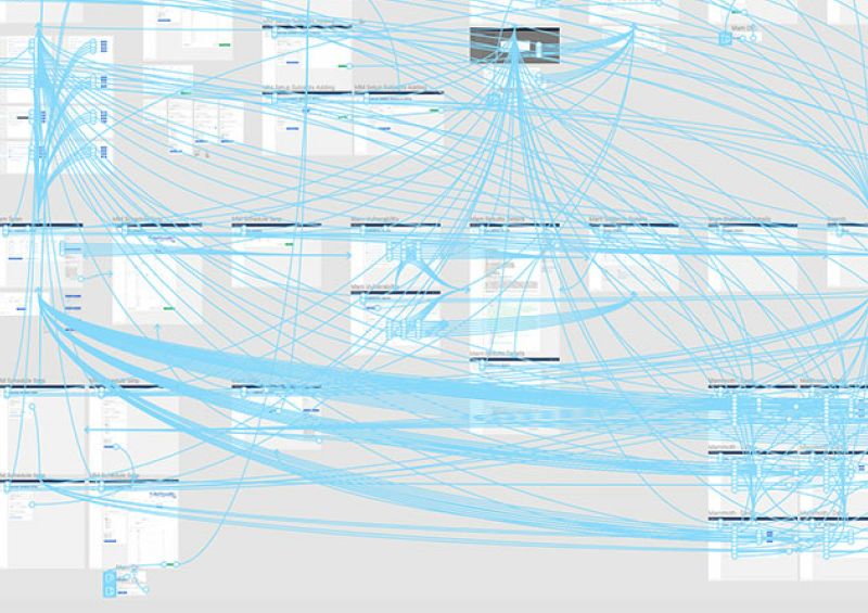
Designing in the browser has been a recent hot topic in the web design community. It refers to a design method where some of the traditional processes and methods are skipped for a more streamlined approach. Normally a designer will use a piece of software like photoshop or fireworks to create a website mockup. This mockup is produced after wireframing, or sometimes in lieu of wireframing and is the visual representation of what the final website will look like. The mockup, however, does not truly represent the final product since many things like interactions, actual rendered type, varied browser/device sizes and a myriad of other important information is not present in that static mockup.
Some designers have adopted a “design in the browser” (for lack of a better term) approach. This means that HTML and CSS code is produced after the wireframing and planning stages which totally skips high fidelity mockups. Photoshop and Fireworks may still be present in the workflow for creating textures or graphics (if needed), or enhancing, retouching any photos the design might use. Designers who design in the browser do it because they feel it gives better feedback during the process, it’s logical to design something in the habitat it will exist in. HTML5 and CSS3 give us many tools and options that eliminate the need for a graphics program in many scenarios.
After reading many articles in favour of this method and their discussions I noticed some trends from commenting designers. Many felt that this method would reduce creativity and encourage only certain design patterns. This thinking has some substance since those graphics programs are extremely robust and can still create things that CSS and HTML alone cannot. It seems many designers also thought it would force them to simplify designs, which they saw as a negative. But are simpler designs a bad thing?
Keeping things simple is a good thing
In the grand scheme of things the web is pretty new. It’s new to designers and users and we can’t really say that much of it is tried and true. Keeping things simple, and removing the clutter, is what keeps everything usable. Usability is one of the most important considerations when designing and building a website or application. If it’s not usable then people won’t use it; pretty simple. There is something beautiful in simplicity and usability, something that Dieter Rams found, something that Apple, Google, and many other companies later adopted. To say that simplifying a design is a bad thing is short sighted. Within simplicity, true beauty is found.
Does designing in the browser hinder creativity?
My short answer is no, but to be honest I can only speak for myself in this regard. When I skip traditional design stages for this approach I’ve never felt like I was being held back, or that the final product was lacking because of a process I used. Creativity is not in the tools we use, but rather in the designer. It shouldn’t matter how the ideas become realities because the ideas and their execution are what matters. To me, designing in the browser seems like a logical step forward when considering how much control HTML and CSS are now giving us. Compounded by the fact that there are now countless devices with countless screen resolutions to consider.
There are always exceptions. At the end of the day everyone’s workflow is different and there is no silver bullet when it comes to design. Each designer must find his or her own path. Adobe’s new line of products like Reflow could prove to be a new path in web design, or complete rubbish. The advice I would give to many of the designers I mentioned earlier is to be open and at least try new techniques, whether they work for you or not, and continue to grow as a designer. We love the web because it’s ever changing and never stagnant. We can’t be stagnant either.